Excelling at Etsy selling is about standing out from the crowd and staying ahead of the trends.

If you think making videos is beyond you, don’t worry: I’ve got some insider tips, pro techniques, and resources to help you out here. And remember, as I tell my YouTube and EtsyU students: we do not have to get it right the first time.

We can experiment with different styles and techniques, see what suits us, and what appeals to our target market. We’ll gain some experience before listing videos go live to shoppers on Etsy, and meanwhile we can post our videos on Pinterest and other social media to test and evaluate follower response. And as I said, if we start right now we’ll still be ahead of most of the rest of the shops.
Before You Start Shooting

The very first thing you want to think about is the feeling of your video. To help you with this, it’s easiest if you first identify who your target audience will be. If you know the people you’re trying to appeal to, then they can give you an idea of the type of video that you’re going to be wanting. Absolutely, have a look at the listing videos that other Etsy sellers are sharing – including these we’ll be using throughout this article: thanks, all!
Also, have a snoop at what big commercial brands are doing. Scout their websites: many feature product videos. What kinds of feeling do those videos capture? Watch the telly; which adverts are designed to appeal to retirees? Urban 20-somethings? Which do you like? Can you tell why? Take notes!
Conveying Style and Mood
One of the ways to convey feelings in a video is by pace. Fast-paced with lots of darting camera action, strobe lights, choppy edits — obviously this style appeals to the young and the edgy, whereas all that can be off-putting, even annoying to the more mature viewer, or to a shopper seeking a bit of soothing “retail therapy” escape. If your items are for teens or twenty-somethings, check out music videos and what’s trending on YouTube: see what moods they convey, and analyze how they do it.
Conversely, perhaps slow and restful videos better suit your product. Languorous pacing, smooth movements, seamless editing, mindfully-curated backgrounds: these can also be used to suggest quality, the feel of a more expensive, exclusive piece. If your bath and body items are designed for people who aspire to an affluent lifestyle and that posh luxury-spa experience, you might want to aim for evoking a leisurely ambience. To suggest an atmosphere where people are serene, relaxed, and well-off, you want polished, clean, well-lit videos.
Note that along with lighting and setting, your color palette makes such a difference! Whether you choose vibrant, clashing colors to express exuberance and fun, or creamy, cool, and subtly modulated tones to evoke purity and calm, be aware that your palette is a crucial component in establishing mood. Color always makes a statement; be sure it’s the statement you intend.
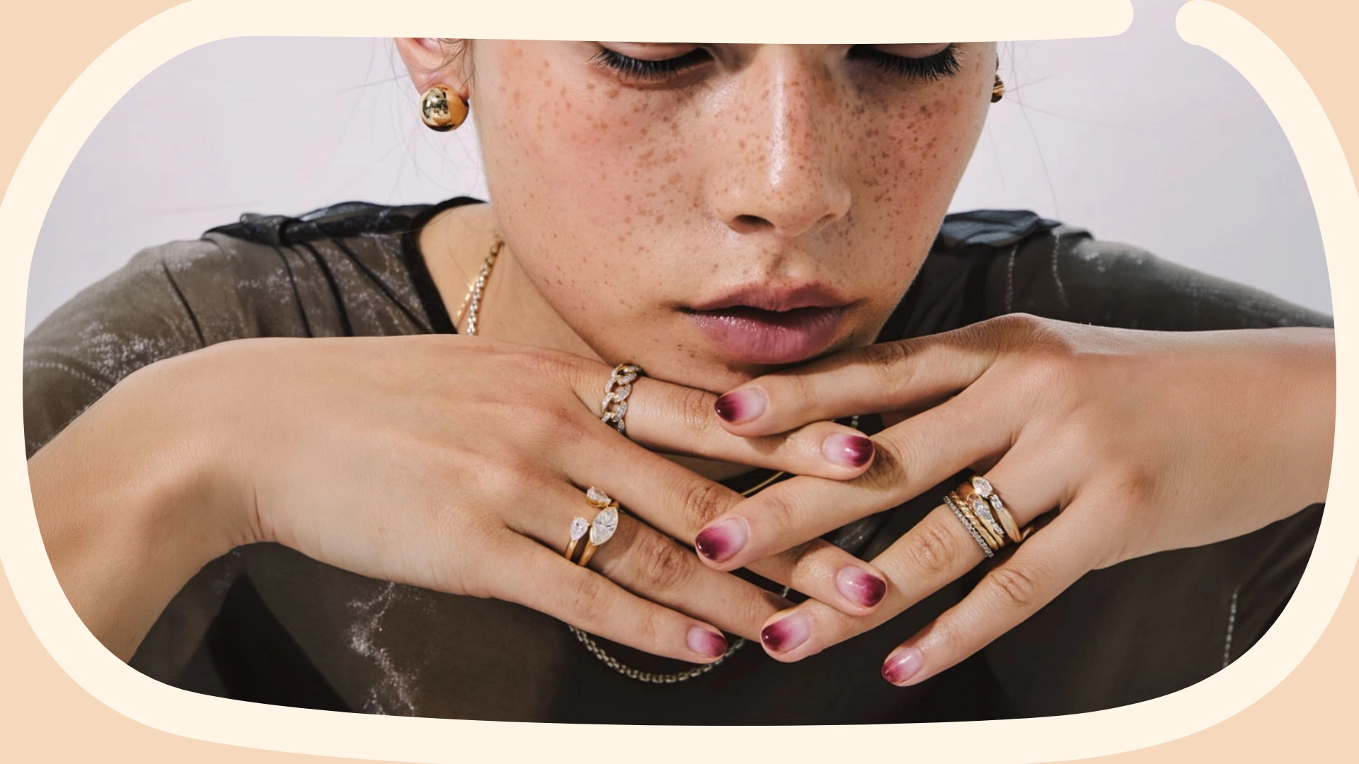
Post-production editing matters. Regardless of how ideal the lighting and setting for your video may be, a bit of tweaking in post-production will improve it. No professional photographer or videographer uses footage straight from their camera. The same as with your own product photography: that always needs a bit of cropping and brightening to look polished, professional, and clean, right? This is all the more crucial for higher-priced items: if you are listing a $2,000 engagement ring, you want buttery-smooth, evenly-lit, slickly-edited videos.
Or perhaps that rustic cottagecore aesthetic or wabi-sabi handmade charm might be exactly what you’re aiming for: a video style that tells a story about a solo artisan in her studio, with all of those romantic associations.
Here, an earthy color palette and lighting that’s more natural conveys a different type of authenticity to the viewer.

Consider your camera angles. The position of the camera in relation to the subject affects how the viewer will interpret the scene. Filming from below with the camera pointing upwards gives a subject an authoritative, aloof and powerful look. On the other hand, if you’re shooting video of animals or children wearing your items, it’s much better to get the camera down to their level. Video shot quite close can give the viewer a feeling of intimacy and cozy inclusiveness. Practice with having your camera at different heights, angles, and distances, and observe how that affects the feel.
Video Types and Techniques
One of the first that got me super excited was stop-motion animation.

Then there’s the “Pass The Brush” TikTok style videos that went viral back in April. If you haven’t seen these, it was a fad especially popular with make-up vloggers. People would show a snip of their own dull self and then reach forward, appear to swipe the camera lens with a big make-up brush, and poof! next you see them all made-up, brightly lit, and looking awesome. Could you do something like that with your creations? You could have your raw material arrayed, then cover the lens for a second, and presto, show your item finished.
Another technique that is both effective and simple is slow motion. Slowing your video down really draws people in, and it is amazing how such a simple change can make things look so much more compelling! YouTube’s Simply Nailogical does this perfectly: beautiful lighting, beautiful feel, and that super close-up, slow-motion drip of those nail polishes … hypnotic! Here, Etsy seller Jojo MacDowall uses this technique, slowing the speed of the video down to make the movement sinuous, smooth, and soothing, with an effect almost like waves lapping the shore.

If your item takes ages to make, time lapse is a great way of showing that off. Just film yourself making it and then speed the film up: people love to see a creation come to life! Rather than just statically filming it, you can shift your camera angle once or twice, then cut to you holding the finished item.

Another way to achieve this time-lapse effect that I use with my digital art is done after I’ve created it. Once I’ve finished my image, I go back through and film myself removing each layer one at a time, then turn it the right way around, speed it up, and it creates a pretty cool result.

No Video? No Problem! Slideshows
If you really don’t want to do video just yet, a slideshow also works to capture the shopper’s eye with movement, and it is easy to create ones that loop endlessly like the gifs in this article. Just Google “create a slideshow from photos.” There are pages of how-to’s using a range of applications, many free.
You could also put your item on a lazy susan and just take stills of it each time you give it a bit of a turn, and then put those together into a little movie.
A step up from a basic slideshow is a technique made famous by and now called the “Ken Burns effect.”

This is simply moving your still pictures so that each picture appears to either zoom in, zoom out, move left, or move right. This is reasonably easy to do in any video-editing software. For tutorials, search YouTube for “Ken Burns effect.” It can make a compelling difference to a still picture if it slowly pans in slightly: that draws you, the viewer, in as Ken Burns’ work so famously does. And if that elegiac effect doesn’t suit you, the same technique can be used to make photographs appear to rotate and spin and do all sorts of crazy flips and whatnot to liven things up – it all makes a still picture feel like a video.
Panning and Zooming in Videos
But let’s get back to videos, shall we? Using Panning and zooming in on an item with video works the same way to draw the viewer in.

Rotating
You can use a motorized turntable to rotate your item. To take it up a notch in terms of technique, it’s also possible to make a really cheap rig so that it’s your camera doing the rotating around the stationary item while, for instance, you’re dropping something from above. Then in slow motion you put that all together and it can look awesome: it’s a bit more technical but kind of fun if you know what you’re doing.
Text Overlays
With Etsy listing videos, there’s no sound but whatever you were going to say, you could add using text overlays.

Tell people this is custom made; that you can personalize it with their name, or that you can work from their photographs. Tell them a little bit about the product, the materials, or your process.
Montages
Here is a beautiful use of montage, in which the artisan displays her materials, process, product, and packaging in a captivating way that gives viewers insight into the maker, her attention to detail, and her superior craftsmanship, all in a few seconds.

There are fantastic channels on YouTube that offer behind-the-scenes peeks at how advertising pros get their shots. Now, most will be beyond our scope, with their purpose-built robots, high-end slow-motion cameras, and proprietary software, but they might give us ideas that we can adapt for our use.
And there’s quite a lot we can do with just our phone or the camera that we already have, and the set up, background, and lights we’ve already got for our routine product photography. You can simply swap out your still camera and tripod head, screw a different head onto your tripod, and shoot a bit of video with your phone. Just add that step to your usual workflow. Simple but effective!


