This post is also available in:
The Creative’s Dilemma: Passion, Profit, and the Power of Color
As an entrepreneur and a creative, you balance passion and profit every day. You pour energy into handmade items and want each piece to stand out. But in the fierce competition of today’s global market, building your brand on Etsy is a unique challenge. In the third quarter of 2025, the marketplace counted 86.6 million active buyers. Developing a brand that stands out on Etsy involves more than just being artistic. You need to think like a scientist as well.
This is one reason the annual color of the year announcement matters so much. The Pantone Color Institute doesn’t just pick a color at random. Their color of the year not only reflects trends in design and fashion; it also serves as a heartfelt, visual response to societal events experienced by people all around the world. For Etsy sellers, paying attention to Pantone’s color announcements connects you to what shoppers are already seeking out. Using these color insights is a strategic way to coordinate your passion and creativity with what shoppers want right now. By aligning your products’ colors, tones, and designs with the year’s mood, you can maintain your brand’s relevance with your target market.
The 2026 Color of the Year: A Strategic Palette for Every Brand
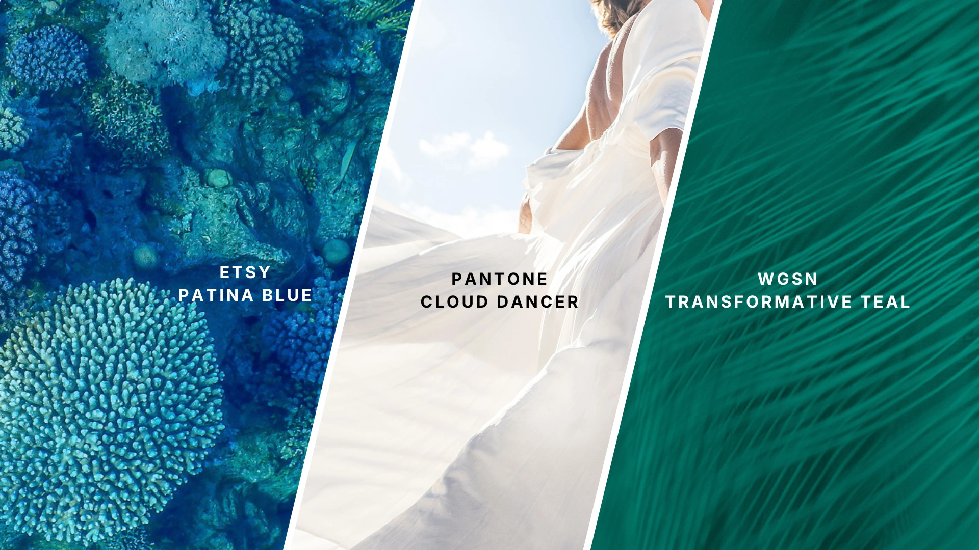
When we talk about the 2026 color of the year, it’s not just one shade dominating the industry. Instead, 2026 introduces a new palette that covers a wide range of needs and feelings. This diverse approach is changing how designers and other creators see color trends.
💡 Don’t miss our free Canva templates for Instagram at the end of this post—designed to help you use the 2026 color trends effortlessly!
Pantone’s Choice: Cloud Dancer for Design and Reflection
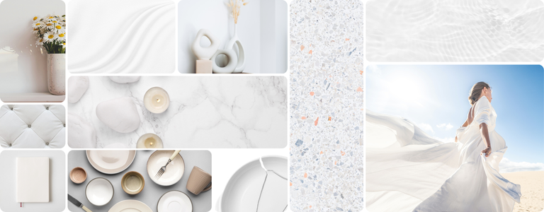
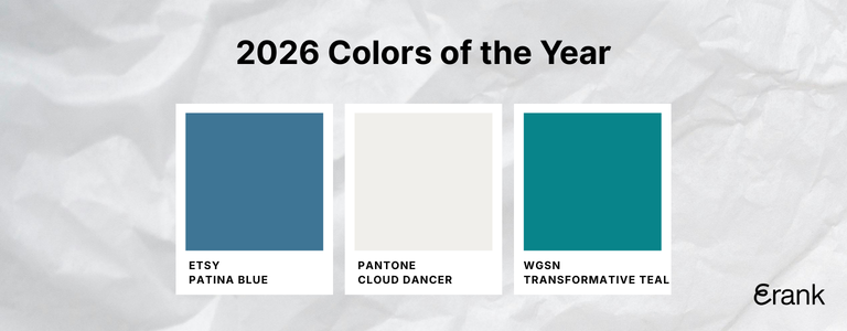
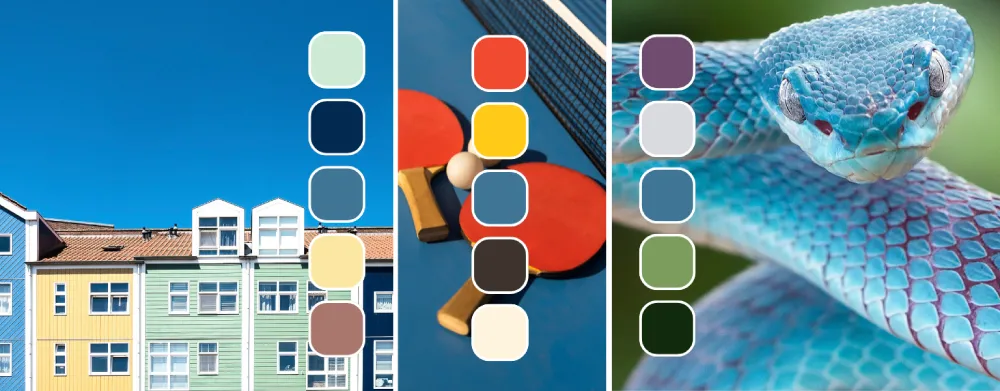
Pantone’s color of the year for 2026 is PANTONE 11-4201 Cloud Dancer. This white color is mixed with just a whisper of grey. It’s not loud or bold. Instead, Cloud Dancer is meant to be used as a neutral background. It acts as a space where other shades and design elements can shine. Its equal balance of warm and cool undertones makes it easy to add to many palettes. This color reflects a global mood: we are in need of peaceful tones to simplify the spaces around us.
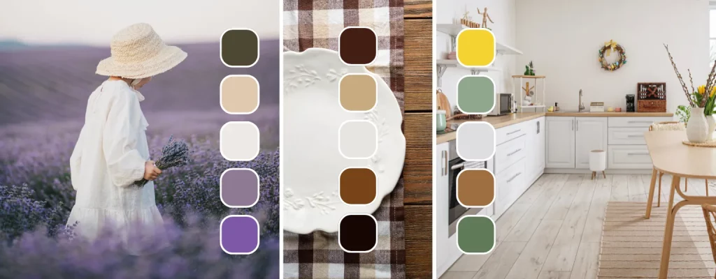
To help you incorporate Cloud Dancer into your designs, here’s a curated palette of complementary colors that enhance its neutral elegance.
WGSN’s Forecast: Transformative Teal Bridges Tech and Nature
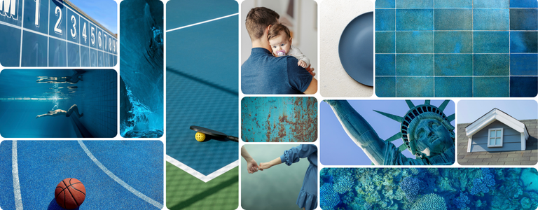
WGSN, another color trend leader, highlights Transformative Teal as a major shade for 2026 because it links technology and nature. This deep blue-green stands out in both physical and digital worlds. It is called a “phygital” color because it connects real-life experiences with digital ones. Tech brands, app makers, and creative companies use Transformative Teal to show a modern, trustworthy look that feels fresh and inviting.
Transformative Teal has a strong meaning. It combines the trust of blue with the energy of green, making it a symbol of growth and hope for the future. You’ll find this color in tech products, software interfaces, and financial apps, where it signals safety and progress. Its value extends to Etsy sellers, too. In digital design, teal is used for buttons and backgrounds to create a calm, high-quality feel that helps brands stand out.
WGSN relies on advanced AI data to predict the rise of Transformative Teal, making this color of the year a reflection of shifts in how technology shapes global color trends and design choices. For any designer or seller looking ahead, this is a color of the year that truly reflects the changing world and the strong influence of technology on color trends.
Etsy Chooses Patina Blue: A Data-Driven Color for Today’s Shoppers
Patina Blue is Etsy’s color of the year for 2026. Etsy did not predict this color ; the platform revealed it based on what people are shopping for right now. Patina Blue is reminiscent of aged copper, which evokes a sense of timelessness. According to Etsy data, searches for “blue copper” rose by 300% and “linen clothing” by 1200%, matching their very first Texture of the Year: Washed Linen.
So, the color of the year isn’t just one voice. Pantone’s, WGSN’s, and Etsy’s picks show a shared theme in 2026. Each color creates an entry point for brands to match their identity with the global mood. With the calm aura of Cloud Dancer, the fresh, earnest energy of Transformative Teal, or the enduring spirit of Patina Blue, the palette for 2026 is expansive and inclusive.
Patina Blue’s timeless charm shines when combined with these complementary tones. Use these palettes to create designs that resonate with Etsy shoppers.
Why the Color of the Year Reflects the Global Mood
Every color of the year reveals something about how people feel worldwide. The Pantone color of the year, in particular, shines a light on attitudes toward cultural shifts and outlooks. Pantone’s Cloud Dancer was chosen with specific intention. The world is busy, loud, and fast, and many feel overwhelmed in every part of their lives. This exhaustion is seen in the colors people choose for their homes, their clothes, and their businesses. The need for soft, neutral, and calming tones like Cloud Dancer is a reaction to this collective chaos.
You can utilize color not only to decorate your products, but also to connect with your customers’ emotions. You’re not just keeping up with a trend. You’re reflecting the collective mood in your business’s story. This is where your products’ colors and tones become part of your customers’ lives, building real connections and trust.
Etsy’s Color of the Year: From Trend to Transaction
Pantone’s color of the year helps with inspiration, but Etsy’s own pick delivers direct value to sellers. Etsy’s color of the year is not a forecast. Instead, it shows what colors or textures shoppers are already searching for.
Data Insight: In 2026, Etsy’s choice, Patina Blue, had strong marketplace evidence. The selling platform’s data reported a 300% increase in “blue copper” searches and a 1200% spike in “linen clothing.” The latter is directly linked to Washed Linen, the platform’s Texture of the Year. This means that the color of the year takes on real buying power and reduces the risk of guessing what shoppers will want next.
With data like this, aligning your products’ design with current color trends is a smart move. It’s not about convincing shoppers to like something new. Rather, it’s about meeting their demand with products that involve the right colors, tones, and feelings at the perfect time.
💡 Scroll to the end for free social media templates inspired by the 2026 Colors of the Year—perfect for your Instagram posts and carousels!
How to Wear and Design with the Color of the Year: Practical Ways to Incorporate Trends
You don’t need to overhaul your whole shop to reflect the color of the year. Instead, make strategic branding updates. Here’s how you can use the 2026 color palette, no matter your products’ styles or categories.
Strategic Product Design: Limited Collections for Maximum Impact
Introduce limited edition items using shades like Patina Blue or Transformative Teal. Limited collections elicit a sense of urgency in shoppers. When these pieces sell out, customers know they have something unique. This approach works in both fashion design and interior design, making it easy to encourage more interaction and sales.
Elevated Product Photography: Neutral Tones for Strong Brand Recognition
Make your product shine with a neutral, soft background. Use Pantone’s Cloud Dancer for a clean, off-white look. Color influences brand recognition by up to 80%, affects how people decide what to buy, and strongly shapes the emotions customers associate with your identity (Journal of Marketing and Social Research). A consistent tone across your photos keeps your branding strong.
Optimized SEO and Listings: Trend-Focused Keywords
When you write your product titles, tags, and descriptions, include the color of the year, paint terms, and key color trend words. Using SEO tools like ours at eRank.com, you can discover high-value keywords that align with trending colors. eRank makes it easy to find long-tail and emerging search terms that other sellers may have missed. Utilizing these terms helps your listings stand out to shoppers who are searching for the latest color trends. Ready to optimize your strategy and boost your shop’s visibility? Visit eRank.com to get started.
Cohesive Branding: Building Identity Around Color
Refresh your shop’s graphics using the 2026 color of the year. Keep color usage consistent across your banners, packaging, packaging inserts, and social media graphics. This approach builds a brand identity that customers can recognize at a glance. It also makes your shop look professional and trustworthy, which is a major purchasing factor for buyers everywhere.
To make these color trends easier to use in real life, we’ve created two sets of Instagram templates in Canva. Both are designed for Instagram posts or carousels and help you explore the 2026 color trends in a practical, flexible way.
Product Showcase Templates
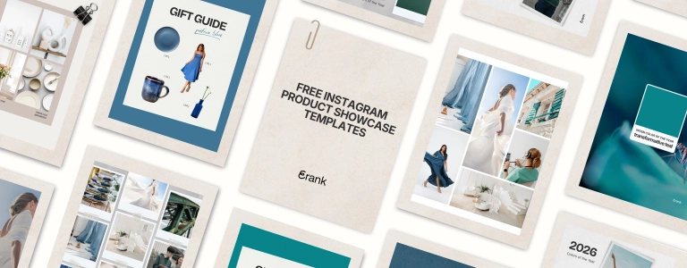
These free templates are designed to highlight your products. The trend colors are used as a clean, neutral frame around your items, helping them stand out while keeping your existing product colors intact.
💡 Download your Free Product Showcase Templates.
Inspiration & Mood Templates
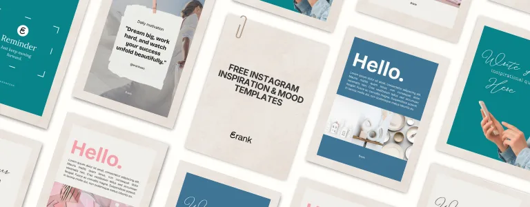
These free templates are more graphic and abstract. They’re ideal for sharing seasonal vibes, collections, or brand inspiration, without featuring a specific product.
💡 Download your Free Inspiration & Mood Templates.
The Future Is a Conversation in Color: Creativity and the Color of the Year
The color of the year announcements, from Pantone and beyond, invite you to take part in a far-reaching conversation, one that’s both global and personal to every business. You don’t have to follow every trend in the industry. However, incorporating these colors into your creative process can illuminate new opportunities and deepen engagement with your audience.
Embrace the color of the year as a guide for creativity, experimentation, and design strategy. Use it to spark bold new product ideas, evolve your brand, and encourage interaction in your community. Above all, let color be a bridge between worldwide sentiments and your creative business, reflecting both society’s collective conscience and your own voice.